Color Trends for 2026: How Bold, Meaningful Palettes Will Shape Brands in the Year Ahead
Color isn’t just decoration - it’s strategy. In 2026, brands are using color not only to catch the eye, but to communicate values, evoke emotion, and define identity in a crowded digital marketplace. Leading designers and trend forecasters point to palettes that balance grounded sophistication with expressive energy, reflecting both cultural mood and business opportunity.
For brands willing to lean into intentional color systems, 2026 offers a chance to stand out, deepen connection with audiences, and turn visual language into competitive advantage. Here’s what’s shaping up as the key color directions - and how your brand can use them to communicate meaning, elevate perception, and drive growth.
2026’s Foundational Trend: Calm, Clear & Strategic Color Use
At the heart of 2026 color forecasting is a shift in how brands think about visual impact:
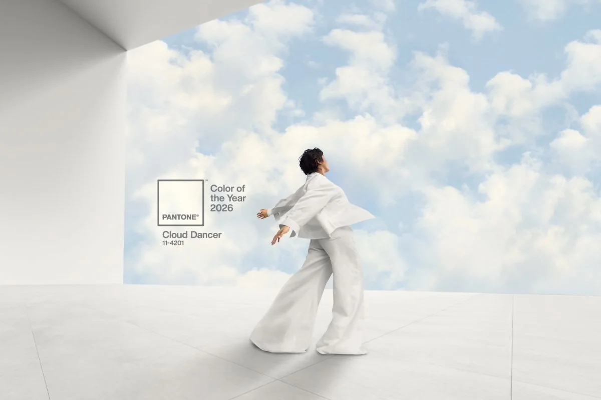
Pantone Chooses a Whitespace Reset
For the first time since the system began, Pantone named a shade of white as its Color of the Year — Cloud Dancer (PANTONE 11‑4201). It represents calm, clarity, and a fresh visual foundation from which other colors can breathe.
This choice signals a broader cultural move toward less visual noise and more intentional design - a backdrop that allows expressive palettes, purposeful accents, and narrative color systems to carry brand meaning.
Major 2026 Color Directions & What They Mean for Brands
Here are the top palette movements backed by design trend authorities and how brands can strategically apply them:
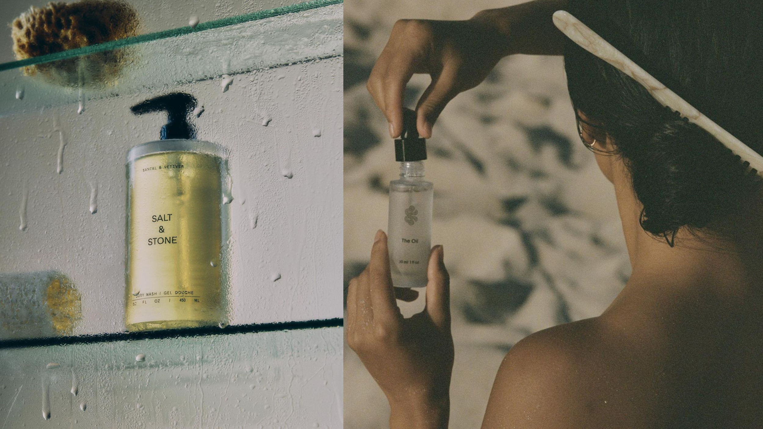
1. Neo‑Neutral Earth Tones - Warmth with Depth
Earth‑inspired colors - from clay and ochre to sand, olive, and muted greens - continue to rise in relevance. These tones evoke authenticity, sustainability, and emotional grounding and are especially powerful for brands that want to express heritage, trustworthiness, or eco‑centric values.
Application Tips:
Use as foundational brand colors across packaging, website backgrounds, and editorial design.
Mix with tactile textures and organic photography to create a sensory brand experience.
For wellness and premium lifestyle brands, earth tones communicate credibility without pretension.
Why It Works: These colors tap into the consumer desire for comfort and connection in a fast‑paced world.
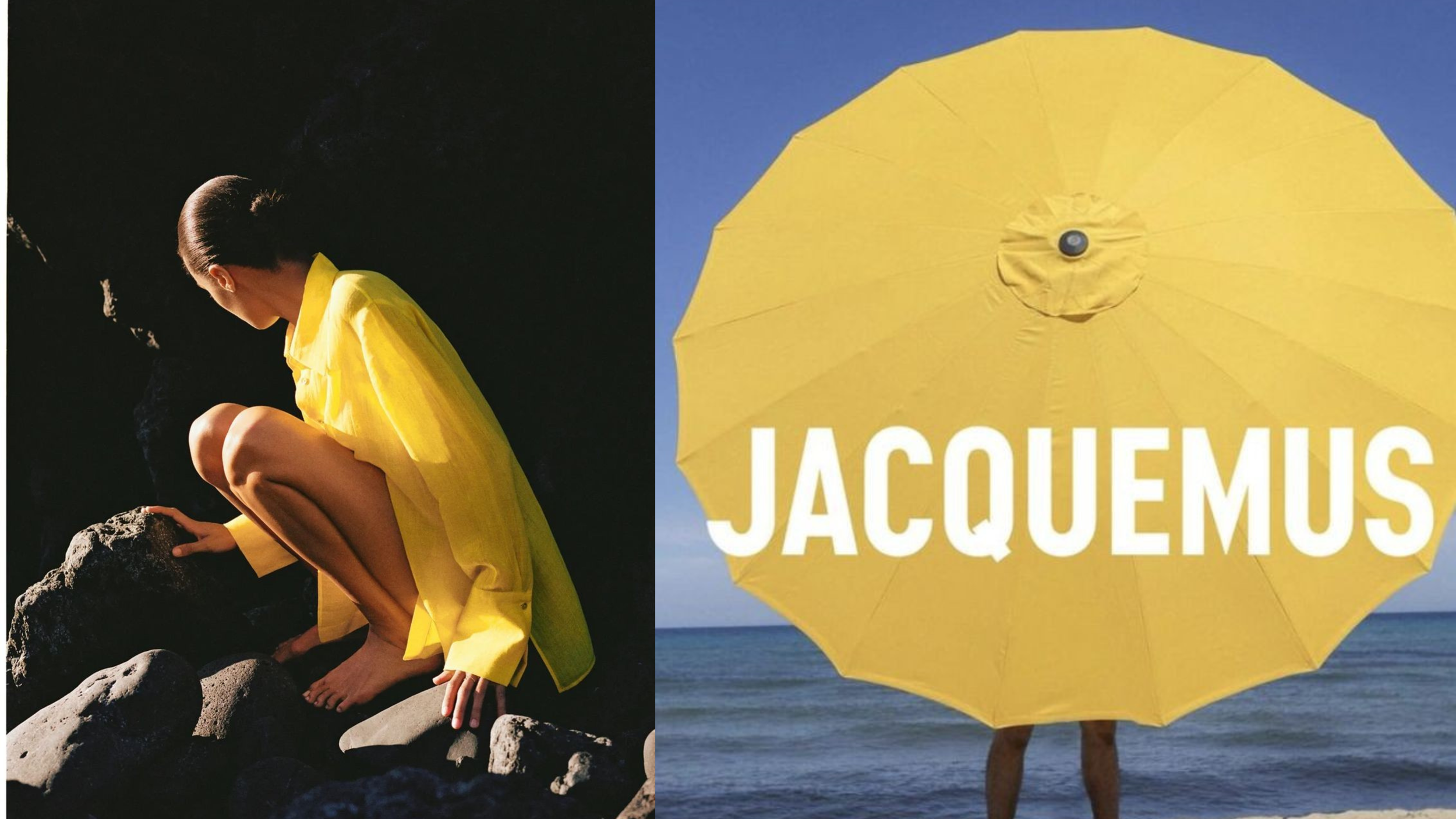
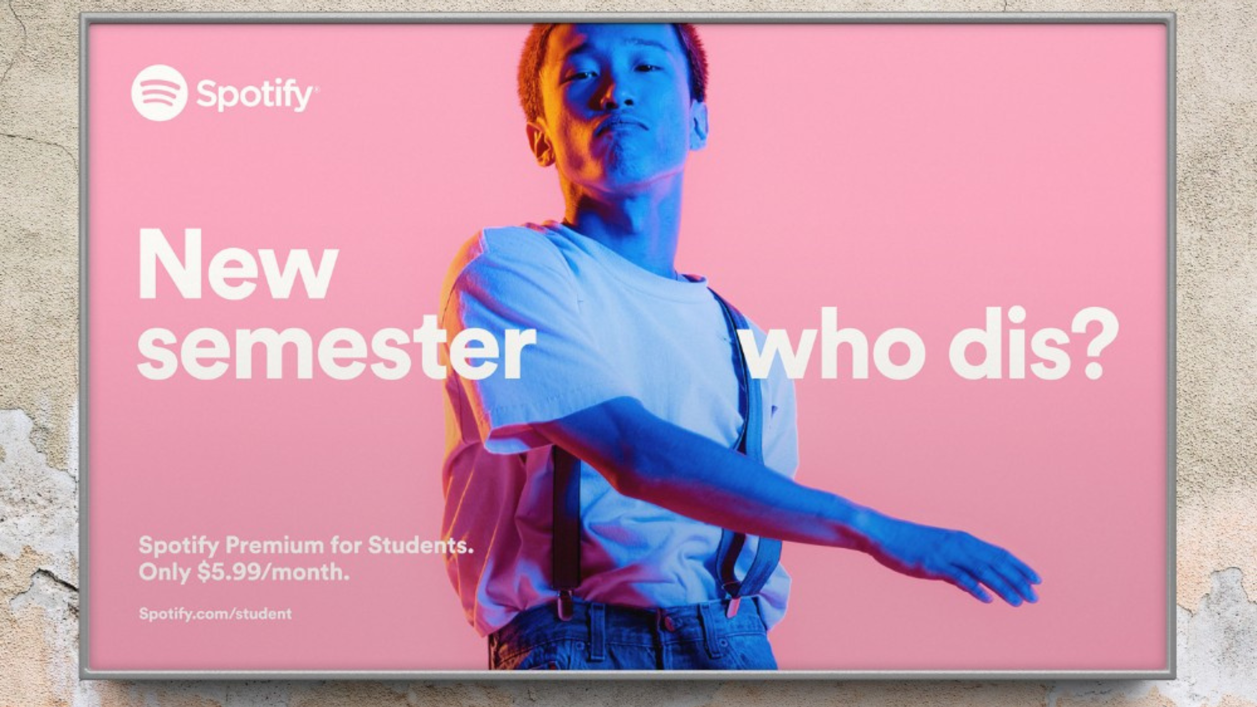
2. Hyper‑Saturated Accents - Confidence and Impact
While neo‑neutrals provide the foundation, 2026 also sees a return of bold, hyper‑saturated primaries and bold accents - red, cobalt blue, citron yellow - that communicate confidence, energy, and modernity.
Application Tips:
Reserve saturated hues for strategic emphasis — call‑to‑action buttons, product highlights, hero imagery.
Use contrast against calming backgrounds (like Cloud Dancer or earthy neutrals) to boost readability and attention.
In digital contexts, these hues perform exceptionally well in both static and motion formats.
Why It Works: In an age of infinite scrolling, memorable visuals create advantage — and saturation helps brands stop the scroll without sacrificing sophistication.
3. Digital‑Twilight & Tech‑Forward Palettes
Deep sapphire, violet gradients, muted teals, and other atmospheric hues are gaining traction in tech and premium experiences. These colors feel immersive and emotionally rich, lending visual depth to digital and experiential brands.
Application Tips:
Integrate into immersive digital interfaces, product visuals, and AI‑assisted design elements.
Use gradients or layered transitions to signal movement and innovation.
Why It Works: These palettes visually communicate forward momentum and emotional resonance, making them perfect for tech, fintech, and creative category leaders.
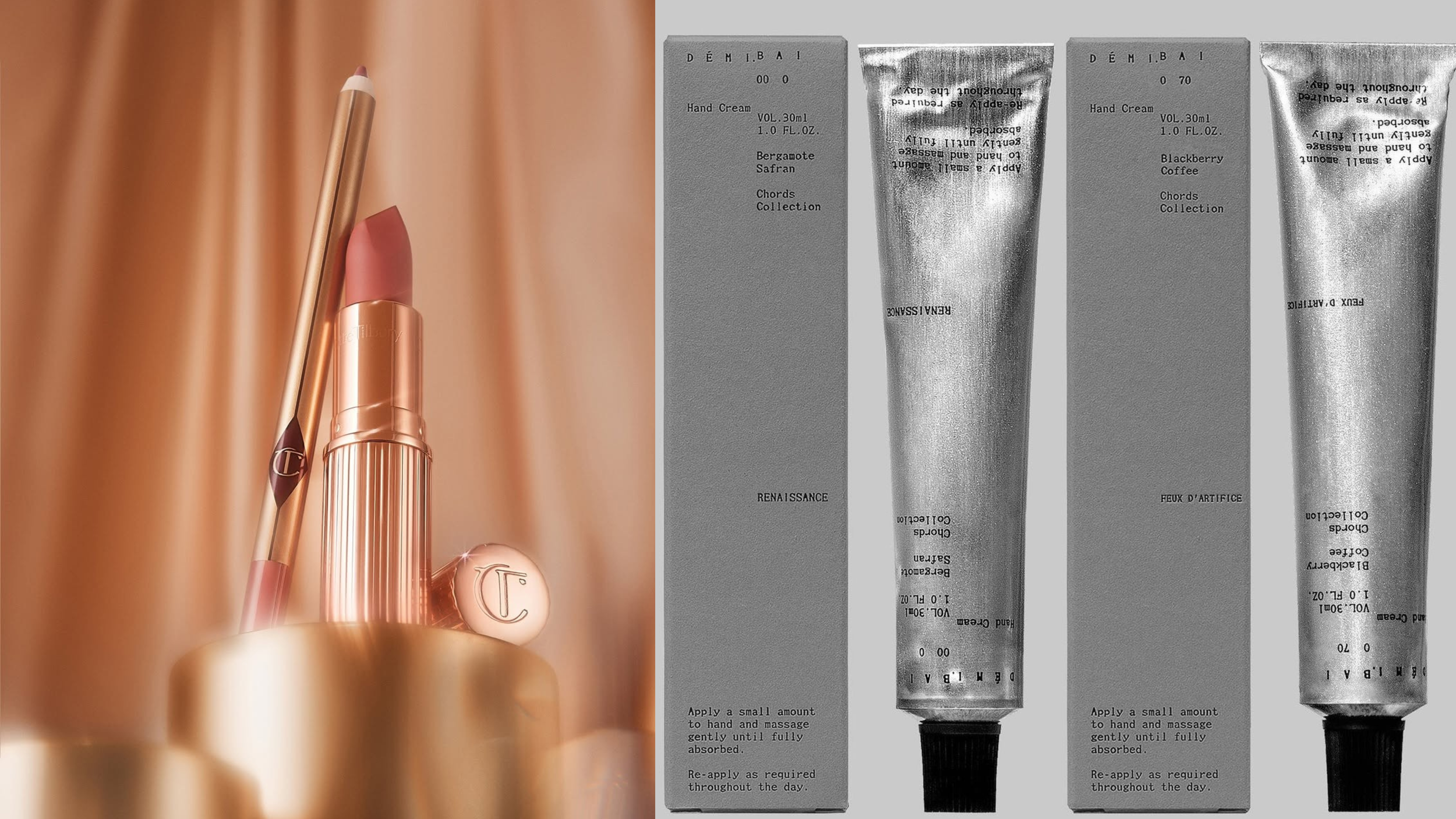
4. Eco‑Luxe Metallics - Tactile Sophistication
Gone are glossy corporate metallics - 2026 brings matte gold, brushed copper, tarnished silver, and artisanal metal sheens that blend sustainability with premium aesthetics.
Application Tips:
Use sparingly as accent elements in packaging, printed materials, or high‑end collateral.
Pair with earth tones and digital palettes to enrich visual language.
Why It Works: These metallics convey quality and heritage without feeling cold, corporate, or standard.
Color Psychology Meets Brand Strategy
Color isn’t just about trends — it fundamentally shapes how audiences feel about your brand. Research shows color choices directly influence perception, mood, and emotional response, particularly in competitive markets.
For example:
Warm earth tones convey reliability and sustainability.
Saturated accents signal boldness and confidence.
Tech‑leaning blues/teals communicate clarity and innovation.
When thoughtful color choices align with brand values, they become a strategic asset — not just visual flair.
How Leading Brands Are Using 2026 Palettes
While trends may shift year over year, many forward‑thinking brands are already applying these directions:
Wellness and lifestyle brands grounding identities in earthy, approachable hues.
Tech and innovative consumer brands leveraging saturated accents and digital twilight colors for visual memorability.
Luxury and artisanal products integrating tactile metallics for sophistication without flash.
These palettes aren’t just pretty — they signal purpose, personality, and positioning in competitive markets.
Making 2026 Color Work for Your Brand
To turn these trends into business impact:
1. Define Your Brand’s Strategic Color Narrative
Move beyond picking “a pretty shade” — understand why a palette reflects your brand’s values and what emotions it should elicit.
2. Use Color to Direct User Behavior
Smart color use improves conversions. For example:
Bold accents for calls‑to‑action
Calming neutrals for onboarding flows
Expressive hues for social camps and seasonal launches
3. Leverage Color Systems Across Touchpoints
Consistency builds recognition. Apply your palette across:
Websites and apps
Packaging and physical collateral
Social and digital advertising
Retail and experiential design
2026 Is a Year of Intentional Color
This year’s visual landscape isn’t about flashiness or fleeting palettes — it’s about emotional clarity, narrative depth, and purposeful differentiation. Brands that adopt 2026 color trends with intention will not only stand out visually — they’ll build stronger connections, clearer category positioning, and more meaningful recognition in a noisy world.
Want Expert Help Bringing Your 2026 Brand Identity to Life?
At Impart Creatives, we turn trend direction into strategic design systems. We help forward‑thinking brands craft color palettes and visual identities that are:
✔️ rooted in cultural relevance
✔️ aligned with business goals
✔️ designed to convert and build authority
Whether you’re launching a new brand identity, refreshing your website, or revitalizing your visual language for digital and retail success — we’d love to help.
Let’s design a color system that sells. Let’s talk.